Historically SharePoint has not had a great mobility story. However I am a great believer in first understanding what we mean by the word “mobility”. For quite some time we have associated this with just the ability to use something on a mobile device when in reality if we do a Google Search we find it actually means: “the ability to move or be moved freely and easily”, with the key words being “Move”, “Freely” and “Easily”. So with this in mind what is the SharePoint Mobility story?
Move
SharePoint has not always had the best design for allowing end users the ability to be anywhere at any time and access their content or even access core SharePoint Services. Each version of SharePoint requires extra configuration for this to work, from custom Authentication to Firewall rules and protection. However once this is done, SharePoint still needs some love to allow end users the ability to access it.
Back in SharePoint 2007, the core options were based around the idea of “Mobile Views” of the content, which were about you gaining a read only view of the content. There were of course issues around devices and browsers that were supported back then too.

SharePoint 2010 enhanced this to give a better experience but still very limited.

This version of mobility allowed for the core site itself to be rendered on a mobile device. By stacking the components on the page almost in a responsive design layout. Most mobile-enabled content was accessible out of the box, however there were some data types that were either not supported or required additional configuration steps. Web part pages, document libraries/picture libraries, lists, blogs, wikis, Office documents, Search and MySite were available out of the box. The “list view” and “image” web parts were also mobile enabled out of the box. Other web parts needed to have a “mobile web part adapter” written which enabled mobile functionality. Pages under the “_Layouts” folder were not available as mobile pages.
SharePoint 2013 then bought even more enhancements to core SharePoint by, bringing a better mobile experience, along with core components allowing the content be targeted to devices. There were vast improvements to the mobile browser experience with the introduction of a new contemporary view. Depending on the mobile browser, users have one of the following browsing options:
Contemporary view: This view offered an optimized mobile browser experience to users and rendered in HTML5. This view was available to Mobile Internet Explorer version 9.0 or later versions for Windows Phone 7.5, Safari version 4.0 or later versions for iPhone iOS 5.0, and the Android browser for Android 4.0 or later versions.
Classic view: This view renders in HTML format, or similar markup languages, and provided backward compatibility for mobile browsers that could not render in the new contemporary view. The classic experience in SharePoint Server 2013 is identical to the mobile browser experience of SharePoint Server 2010.
Full-screen UI: There is also the ability to have a full desktop view of a SharePoint site on a smartphone device.
The contemporary view was the best approach for this.

These core mobility features first needed to be activate at the site level using a feature that was specifically added to SharePoint 2013. Previous versions of SharePoint Server included a single default mobile view that was auto-generated based on the existing site, and that default mobile view was not easily customizable. Now, with “device channels” in SharePoint Server 2013, you can render a single publishing site in multiple ways by using different designs that target different devices based on their user agent string. You create a single site and author the content in it a single time. Then, that site and content can be mapped to use different master pages and style sheets for a specific device or group of devices. Also, you can easily show different content to different device channels using the same page and page layout.

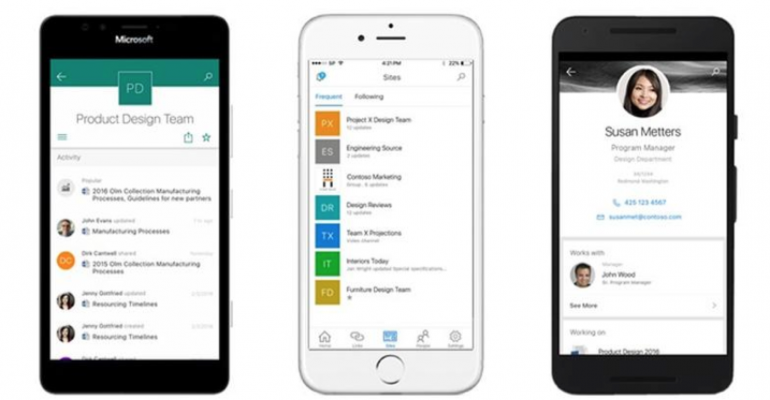
SharePoint 2016 has now added an even richer experience for the mobile user. As well as still supporting the SharePoint 2013 options, now we have the ability to utilize a fully native SharePoint Mobile App. This will allow as Microsoft have coined the phrase “Intranet in your Pocket”.

With the Office 365 platform now being enhanced frequently, Microsoft has made sure that all the core stack is now available on any device at any time.
Freely
If we look at how we all work now, we all carry mobile devices, often multiple, and our expectation of accessing our content anywhere and anytime is now more important than ever before. You can see that Microsoft has listened with the mantra of “Cloud First, Mobile First”. Due to the consumer space of applications, enterprise users are now expecting the same experience. Historically, because we had to use an internet browser, we became tied to a device such as a laptop or desktop, so the mobile story was not needed. Now with applications being the main path that users access content, SharePoint had to evolve.
Office 365 has been the core reason that these features have been now added to SharePoint Online. Browsing a SharePoint Site in Office 365 now results in a tile type layout, and once clicked into breaks out the link clicked into clickable links that let you browse easily around the sites.


To achieve this Microsoft launched the “touch mobile experience” into Office 365 and then back into SharePoint 2016 On-Premises.

Easily
Finally the question to ask would be: “Are these mobility options enough?”
Really the mobility experience is not just the whole mobile device experience, it is all about that experience and the “anytime, anywhere” idea. To achieve true SharePoint Mobility, we need to adopt the same mantra as Microsoft and allow these features.
We need to “enable the core SharePoint Mobile features”, instead of blocking them which is quite common. Removing the “text-only” mobility features will bring a better graphical experience that will match or be close to what your users are using in the commercial application world. Ensuring that the design you choose for the overall SharePoint sites, is “mobile ready and designed for that mobile experience“, should now be a top priority and should be going forward, with any application now.
To complete the “easy” design, utilizing a solid authentication mechanism that allows for mobile workers to easily access it versus, making them jump through hoops to get there will bring better adoption.
I am excited about what the future holds for SharePoint Mobility, especially with the announcements made for the native mobile device applications.

Also with the core features in Office 365 that allow for rendering and editing files on any device, sync ability using OneDrive, Groups, Delve along with core SharePoint features now makes the mobility story a reality for any device at any time.


